06. Violin Plots
L4 061 Violin Plots 2 V3
Data Vis L4 C06 V2
Violin Plots
There are a few ways of plotting the relationship between one quantitative and one qualitative variable, that demonstrate the data at different levels of abstraction. The violin plot is on the lower level of abstraction. For each level of the categorical variable, a distribution of the values on the numeric variable is plotted. The distribution is plotted as a kernel density estimate, something like a smoothed histogram. There is an extra section at the end of the previous lesson that provides more insight into kernel density estimates.
Seaborn's
violinplot
function can be used to create violin plots combined with box plots – we'll discuss box plots on the next page.
sb.violinplot(data = df, x = 'cat_var', y = 'num_var')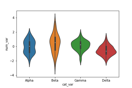
Here, you can see that the numeric data takes on a different shape in each categorical level: Some bimodality is suggested in group Alpha, a relatively high variance is observed in Beta, and Gamma and Delta are skewed negatively and positively, respectively. You can also see that each level has been rendered in a different color, like how the plain
countplot
was in the previous lesson. We can set the "color" parameter to make each curve the same color if it is not meaningful.
Inside each curve, there is a black shape with a white dot inside. This is the miniature box plot mentioned above. A further discussion of box plots will be performed on the next page. If you'd like to remove the box plot, you can set the
inner = None
parameter in the
violinplot
call to simplify the look of the final visualization.
base_color = sb.color_palette()[0]
sb.violinplot(data = df, x = 'cat_var', y = 'num_var', color = base_color,
              inner = None)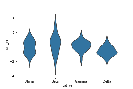
Additional Variation
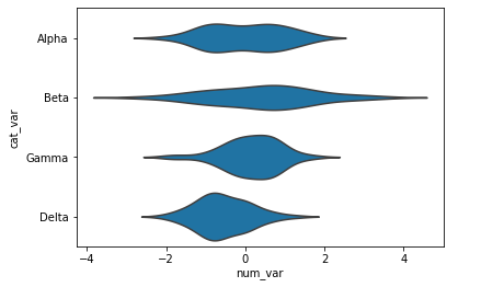
Much like how the bar chart could be rendered with horizontal bars, the violin plot can also be rendered horizontally. Seaborn is smart enough to make an appropriate inference on which orientation is requested, depending on whether "x" or "y" receives the categorical variable. But if both variables are numeric (e.g., one is discretely-valued) then the "orient" parameter can be used to specify the plot orientation.
base_color = sb.color_palette()[0]
sb.violinplot(data = df, x = 'num_var', y = 'cat_var', color = base_color,
              inner = None)